Captioning Videos that You Do Not Own

When addressing content accessibility in courses or websites, what do you do with a video that you don’t own? In my experience  building out our faculty development website, iTeachU, and in augmenting courses to be fully accessible, I have learned a few tricks. I’ll share these here!

First, let me just say that you should always caption your own content. UAF eCampus captions by default all content that we produce and that is produced in partnership with us. UA has an institutional pricing agreement through a third party vendor, 3Play Media. We also make use of other third party services such as GoTranscript, Trint, and Verbit.ai depending on the turnaround time needed, nature of the video content, amount of captioning required, and other factors.

YouTube

If the video lives in YouTube, you might luck out and be able to contribute captions to the video directly. YouTube has a feature known as community contributions, which allows anyone to submit captions or subtitles in any language. This is not on by default for videos or channels (please go to your channel now and turn them on!), so this isn’t as common as would be preferable. In reviewing third party video content on iTeachU, at least one video had community contributions turned on. This allowed us to add captions that we paid to have created, wait for it to be approved by the video owner, and leave the embed intact. One particularly important video, however, did not anything other than YouTube’s autocaptions. I attempted to contact the creator of the video to ask him to turn on community contributions, but given the complexity of his email how-to webpage, and his lack of response, we had to figure out how to add our own accurate captions to the video.

The broad solution is to find a way to rewrap the video in an external player that can serve the video from its YouTube source, but inject captions separately. This allows you to not touch the video or its copyright, but apply your own captions to it. This doesn’t require permission or any privileged access.

There are three specific solutions that I have found:

Kaltura MediaSpace

This, currently, is our preferred solution. The UA-wide installation of Kaltura allows users to add a YouTube video as an entry in Kaltura itself, while still serving the video from YouTube. These videos must be public or unlisted (Kaltura’s instructions specify public videos, but unlisted videos will work). Once you have your caption file created for the original video, you simply upload the caption file to the new Kaltura entry for the video and it will play back in the Kaltura player:

PlayPosit

PlayPosit does effectively the same thing as Kaltura Mediaspace. It rewraps the video stream in another player that can display captions that you add manually. This is a bit of a workaround, because PlayPosit is designed to add interactivity to the video. It also could introduce some confusion to the viewer, since the video is presented as something more than a video, and without actual additional interactive elements, folks might be a little flummoxed. But it works, and this is accessible to anyone using PlayPosit, even the free tier.

Amara

Amara is a free, open-source tool for creating captions for video content. It also allows you to add captions to a third party video in YouTube and will give you an embed code that can be added to a website. It does require Javascript and the embed code required some tweaking to display properly here in WordPress (the <div> size had to be manually set to allow the embed to appear properly (by adding style=”height: 360px;” to the div tag). But it does work.

JALT 2018 Poster Presentation: Enhancing Cultural Exchange via Augmented Reality

In November of 2018 I had the chance to present a poster at the Japan Association for Language Teaching conference in Shizuoka, Japan. The poster outlined some work I was involved in during the summer of 2017 along with my colleage at the University of Alaska Fairbanks, Dan Darrow. Here’s our short abstract:

Short Abstract

Using a mobile augmented reality app, a short cultural exchange of Japanese university students to the United States engaged in a scavenger hunt style exploration of their host campus, using GPS location, bluetooth beacons, through-the-lens AR, photo uploading, and social commenting. Student reaction to the game was positive, with affordances clear in comparison to traditional classroom activities or a paper-based scavenger hunt. Future iterations will build on this initial pilot experience.

Click on post for a larger, readable version (1.5mb)

Full Abstract

This presentation outlines an attempt to expand an exchange program of 20+ Japanese university students beyond the classroom. In the program, students spend four hours per day over two weeks studying English at a university in the US. With the goal of bringing the student language experience closer to their surroundings, an augmented reality scavenger hunt was developed in ARIS and played over two days. Interacting with the historical environment of the campus and through L2 problem solving in English, it was hoped that students would gain cultural understandings and make connections to their immediate environment. Students worked in small groups using personal mobile devices, and interacted with virtual historical characters as well as real people on campus. This AR scavenger hunt improved upon the original paper-based version due to its familiarity, immediacy, and ability to layer meaningful information and media on real world objects. Student responses were solicited post-activity and were mostly positive. Responses showed nuanced understanding of gameplay mechanics and useful suggestions for improvements. Future implementation will incorporate these improvements and attempt to redesign with higher priority on opportunities for linguistic interaction.

Poster Design

This was my first time designing a poster for a professional conference. I therefore overthought the process completely. I spent weeks just deciding on what piece of software I wanted to design it in. Every template I could find was the standard science-fair three column layout and I wasn’t willing to accept that. The best source of materials for gaining inspiration and moving my creating thought process along was actually YouTube. A German gentleman gave some excellent advice on how to structure information and what an appropriate area for citations and credits looked like:

Another showed, silently, the process of laying out a poster on paper first, along with ways to reimagine the logical structure of a design into a less traditional visual layout. This one was what finally helped me break my logjam of apprehension and actually start designing the poster toward a product that I would eventually be satisfied with.

My Process

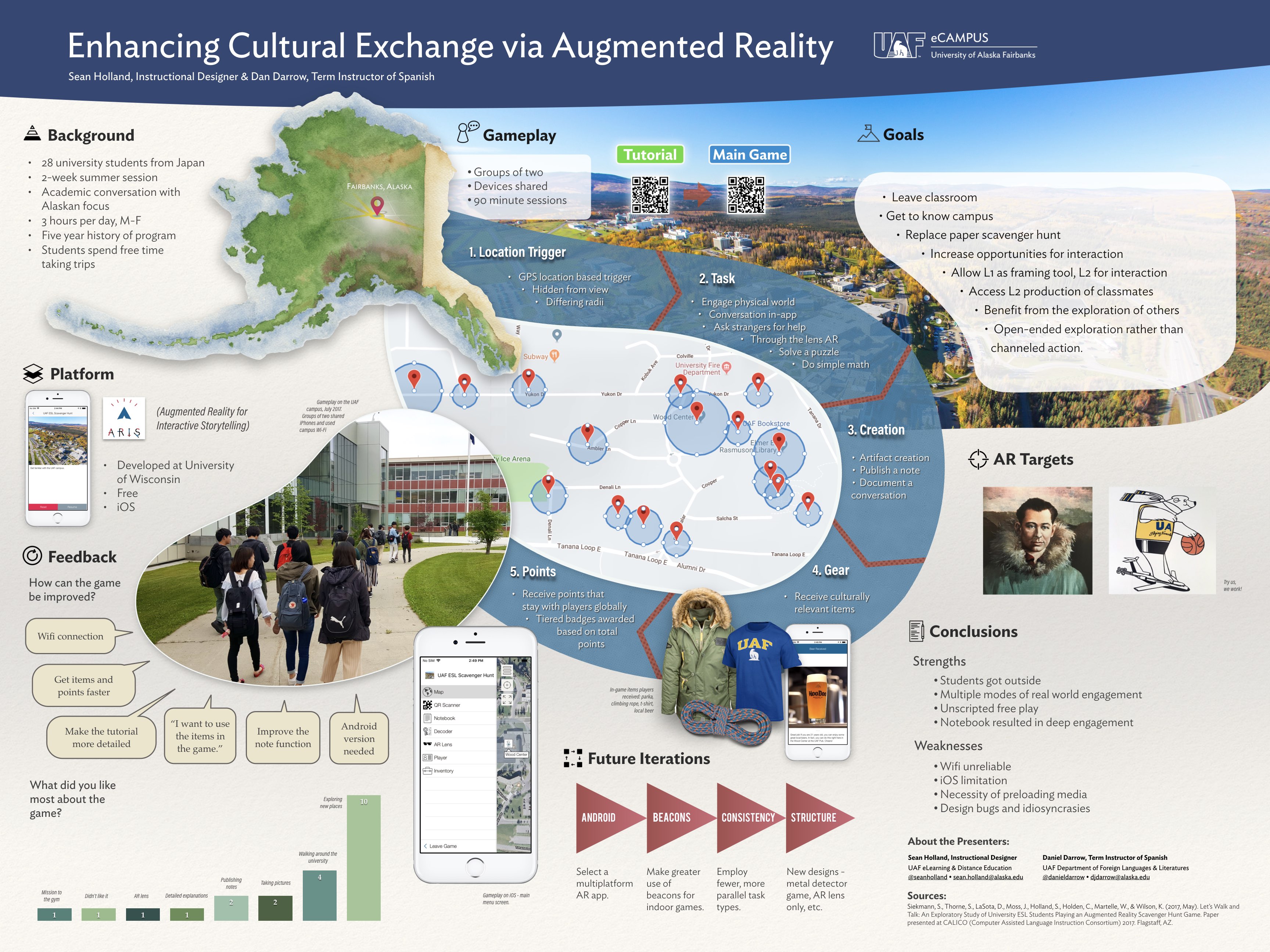
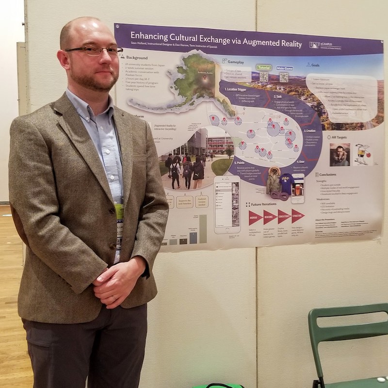
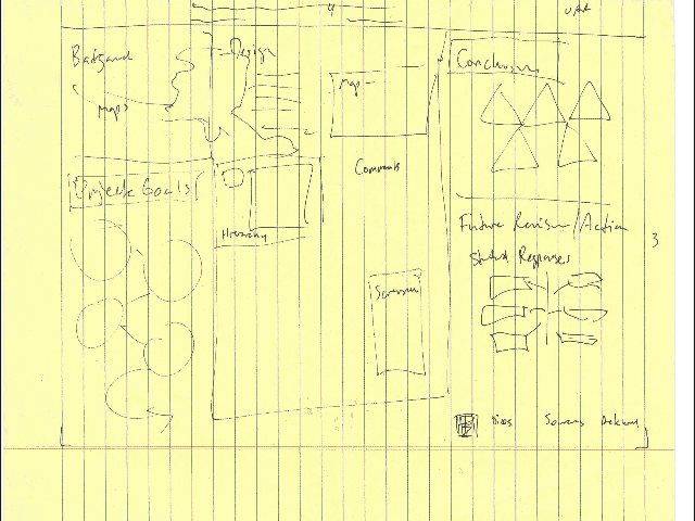
I used Keynote to design the poster after sketching it out roughly by hand. I have used Keynote before to do things that require a lot of visual elements, and I was pleased that I didn’t have to make any serious compromises or devise any major workarounds to create the design I wanted. It was very useful to work on the presentation on a large 5K iMac monitor, although I also did a fair amount of work while in a cramped coach airplane seat.

Conference Presentation

The response to the presentation was quite positive. Many of the attendees were more interested in virtual reality for the purposes of preparing students to go abroad, but I think they appreciated the opposite, of using AR to guide and orient students while they are abroad.

I had very good swag, so some may have simply pretended to be interested, but I made a few strong connections. One instructor was fascinated that I had created the poster in Keynote. I honestly think that my poster design may have interested some more than the project that it was designed to explain.

In terms of the comprehensibility of the poster, I think the intended visual flow of the blue swoop around the location trigger map made sense to people, in terms of answering the question “what did the students do?” The QR codes confused people, since QR codes are common in Japan, many people pulled out their QR reader app thinking that they would be able to experience the interactive elements that way. But since they were ARIS-specific game codes, I had to hand them the iPhone 6 that I had brought as backup. That was effective in order to demonstrate the through-the-lens AR targets, which was a conceptual eye opener for those who needed to get up to speed on AR.


Iterative Improvements on Video Content

It’s my view that the inclusion of any video in an online course can add to the learning experience of students (with the exception of lengthy lectures). However, not all videos are created equal, and it’s always nice to have the best production values possible. I recently had a successful experience improving the production quality of an introduction video in one of our flagship courses at UAF eCampus.

The original video above had been shot on a whim in the fall of 2014, and had served successfully in the course for multiple offerings. It had some areas that could be improved, however. The tripod hadn’t been level, the audio wasn’t great, the day of the shoot was overcast and dull, and the quality of the video itself appeared to have gone through several compression cycles. So with new equipment, a nicer day, a larger production staff, and the same instructor, we shot it again:

I also added the titles with the instructor’s guidance, and we conducted a separate shoot to get b-roll of various locations mentioned in the monologue.

Overall, I believe this is quite an improvement and a good example of how video can be included effectively in a course while not being perfect, and later built upon to create an even more polished product.

Adopting a Learning Glass at The University of Alaska Fairbanks


The Learning Glass, or Lightboard – call it what you will, is quickly becoming adopted at universities by instructors and designers as a practical method of jumpstarting the traditional talking head or whiteboard instructional video. At the University of Alaska Fairbanks, we have been aware of the tool for a couple of years, first stumbling across the very good and pioneering instructions put together by Michael Peshkin of Northwestern University. At that time, having no space to put such an object, and not being engineering professors who felt qualified to build a large glass-supporting assembly, we treated the tool like so many others that come across your desk – as a novelty that we couldn’t justify owning ourselves.

A year or so passed, and Owen Guthrie, a fellow instructional designer, attended a conference held at GWU in Washington, DC, and came across information on the homebuilt setups at other universities such as Vanderbilt  and University of Florida.

We still really didn’t feel like building one. The cost of our time, and the potential for wasted materials or a substandard result seemed like obstacles we weren’t willing to attempt to hurdle.

But we saw what others saw in it. I remarked at the time that this “could be a killer app for engineering/science faculty who just can’t get over the admittedly cumbersome tech hurdles with pencasting/screencasting.”

We really just wanted to buy something that already worked and innovate from that point, rather than making half a dozen trips to Lowe’s and hauling glass and steel across campus at 30 below. Owen found that one of the early adopters of this tech, Matt Anderson at San Diego State, was also manufacturing and selling units, termed “Learning Glass” rather than Lightboard (I do not believe this is a trademarked term). We bought one right away, and after dealing with some difficulties in the shipping process to Alaska, made it a part of our media studio space.

We have had it in our space for about 8 months, and have already produced over 100 videos for faculty using the glass.

Last month at the Conference on Higher Education Pedagogy, two staff members from Wake Forest University presented on their implementation cycle and discoveries on building their own Lightboard unit (including a great deal about how they overcame institutional inertia and limited budgets to make it a reality). Seeing their similar but relatively unique approach was eye-opening and I learned something, as well as developed the urge to build a very cheap portable version. One very important point that they made was that (other than this Educause review) there currently is no peer-reviewed literature in educational technology or pedagogy journals on the implementation, use, or theoretical foundations behind the application of a learning glass to the creation of distance or flipped video materials.

We have found that simply installing one is not enough, that users have to be coached, and that there is a rather slow learning curve for instructors to make content that they are satisfied with. Response from both instructors and students has been overwhelmingly positive, but there is the possibility to deliver unengaging and visually poor content via this tool. Considering that the mixture of technologies that comprise a Lightboard are each not particularly new, but that in gestalt they seem revolutionary or the tool of the moment, I wonder what adoption and use rates will look like in 5 to 10 years, once any novelty wears off. I would like to explore these questions in further blog posts.


Being a Robot – Week 1

I am working remotely for a few weeks, so I have been making active use of our office’s Double robots. It’s been a year and a half since we first started using our Double 1, and about a year for our Double 2, which has some more advanced stabilization and speed features. While most of my daily tasks don’t require me to be synchronous and present in the office, I have made a point to drop through on the Double every other day or so. I thought it would be interesting to chronicle my experiences and challenges in a weekly blog post, so here we go!

Thursday, October 20th, 3PM

Although the Double robots are well designed pieces of technology and we have done a lot of work ensuring that they are setup in the easiest to use and most robust way, glitches can often happen, which are often impossible to fix without texting or calling someone else in the office to go rescue the robot wherever you left it, helplessly idling. This day, however, the technology performed flawlessly and I felt like I was taking advantage of its affordances in a newly effective way. The connection was simply excellent, and I really felt like I was present in the office with my colleagues. Obviously, I know my way around the space very well and have lots of practice driving these robots, but the overall quality of the image and my own immersion in that remote space was convincing and powerful. At one point, I was able to assist a student employee, looking over his shoulder while he worked on a video editing project. I could even see the screen well enough to get a general idea of what he was doing, although to give him specific directions I did open up the same program on my end as well.

Here’s what that looked like:

double10-20

Best Practices for Video: Stand Up

I conducted an interesting experiment with video last week that yielded a fairly conclusive result. Simply, stand up in your videos. I recorded a short script in our TV studio on a greenscreen backdrop, and initially shot it while sitting down on a high stool-type chair. We have used this chair for other instructors to sit on while recording content videos and it seemed to work fine. However, a colleague, Owen Guthrie, had the opportunity to tour the media production studio at George Washington University a few weeks ago, and he made the point that their video subjects simply stand. I got to thinking about what this means for poise, presence, confidence, and aesthetics. So the next day, I grabbed the same blue shirt, and headed over to the studio to rerecord.

I ended up using the video of me delivering the script while standing as the final version. My hand gestures seem more natural, and stem from my core, not from my elbows resting on the chair. I am also directly facing the camera, and my hand gestures are more fronted.

Standing Version (used in final edit)

Then there is  the initial version where I am seated, embedded below. Notice that I am at a slight angle to the camera, and the chair is enabling me to hunch over unnaturally. It’s similar to how having a podium can encourage some bad habits in public speakers – gripping the podium, being static. It was sort of nice to sit in a chair, but was it at all necessary? I also had difficulty pulling a clean matte on the color key due to green spill on the reflective black arms of the chair. This slowed down my workflow and probably affected the quality of the matte edge on other parts of the image. Overall, I think the chair impedes my message and hinders my authority as a speaker.

Seated Version (not used in edit)

So I think we can coin a new best practice for video creation with single speaker subjects, at least in our studio environment here at UAF: Ditch the chair and stand up.

Playtesting Cards Against Community

cardscommunityCreating and managing rich and productive online communities is one of the major challenges in teaching online. It’s an area of focus here at UAF eCampus and we devote a lot of attention to helping faculty facilitate positive discussions in their courses. The question of how to manage a discussion forum effectively can end up being very specific to an instructor’s situation, but it is still possible to have a general awareness of the types of actors that frequent online discussion forums. Bringing this understanding to the task of online moderation  can help to manage them effectively. Cards Against Community, a new card game, tries to do this in a fun, face-to-face way.

I came across the game on Twitter. Alaska Dispatch News recently changed its online commenting system from Facebook to Civil Comments, which uses a peer-review driven algorithm to weed out uncivil comments, without the need for moderator review of each comment. It seems to work brilliantly. After following Civil Comments (@HelloCivil) on Twitter, I stumbled across Cards Against Community and was immediately intrigued. It was created by The Coral Project (@coralproject) and is described as “A game of conversation, moderation, and trolling for 4-6 players.” It seeks to spark thought about “how moderation tools and community structures change users’ experiences online.”

These are laudable goals, and I thought that it deserved a playthrough. Last Wednesday evening, several colleagues and I sat down and played through the game twice. Here are my thoughts:

The Head of Community role is absolutely necessary.

We started out the game with only four participants, which is actually not enough. The game can be played with 4-6 players, but an additional person is always needed to act as “Head of Community” (HOC). I skirted this rule by acting both as a player and as HOC. It became clear after a few rounds that someone needs to be impartially monitoring the discussion and keeping track of player contributions. I wasn’t able to remember the choices I had made as HOC once I entered my role as a participant. It’s important to keep these separate, just as you might in an online discussion. So, you really need at least 5 people to play this game effectively.

The topic cards are not interesting.

One of our first conclusions was that the topics themselves were not generating discussion. Much of what we actually said on  given  topics (newspapers, cycling, Disneyworld) was flat and uninspired. It felt a little forced, and we all agreed that the topics were not intrinsically interesting or engaging. We suggested writing topics in the form of more divisive statements, or as questions without simple answers. One player even suggested that we simply use a deck of white cards from Cards Against Humanity as the topic cards. In any case, the existing topic cards need to be abandoned or rewritten with more vim before we use them again.

Moderation cards are hard to play within the allotted time span.

The two minute limit seemed too short at first, but by the end of the second play-through, it came to feel about right. However, we never became proficient at using our moderation cards effectively during the rounds when each player gets one. I realize that this might be a deliberate mechanic to demonstrate how vigilante moderation doesn’t work, but it felt frustrating. During round 3, when one player becomes a moderator participant and has all of the moderation cards to use as they see fit, the conversation seemed to flow more smoothly and the game was more fun, partly because none of us had the burden of trying to think about our moderation card as well as our own aims for our role.

The character cards reflect the spectrum of possible participants.

The character cards seem to be the most polished and well thought out part of this game. Some could be refined so that they are more obvious to first-time players (some of us played our roles very inaccurately at first) but they span the range of possibilities quite well.

Final thoughts

I like this game. It’s visually appealling, free, open to modification, and is about 80% effective at bringing participants to a critical point of thought regarding how online communities work and how moderation changes them. Some aspects, such as those above, could be improved or simplified. I might remove or collapse the “Aim” description on the character cards, since the options are binary – you are either a troll or you are not – and this should hopefully already be obvious to players. I also might remove the points-based play from the game. We did not play with points, since I was unable to manage that as HOC and a player. In the end, we had a lot of fun without even considering points. Cards Against Community is a fairly simple, free, thought-provoking game with some room for improvement (and that allows users room to improve it!). I hope to use it in a faculty development seminar next month. You can download the PDFs of the cards for free or purchase printed cards of the game at the Coral Project website.

Slate Embed Test

Embed test of an Adobe Slate (now Spark Page) post. There appears to be no way to dynamically embed the Spark Page into a website, so this is rather a false embed that generates an image that links to the Page itself. At least it does it automatically:

Denali Road Lottery 2015

Alaska’s Spending and Revenue Model

I worked on this animation for Alaska Governor Walker’s Sustainable Future initiative. Animation was storyboarded on white boards, then mapped out in Videoscribe into eight panels, and refined over several weeks and four major reedits to the finished product below. SVG assets were used either from VideoScribe’s free library, or created from scratch in Illustrator. Audio was recorded in Audacity and mixed in Adobe Audition. A final revision edit was done in Adobe Premiere.